[!] この記事は公開されてから1年以上経過しています。情報が古い可能性がありますので、ご注意ください。
当社の文教向けソリューションV-Boot ⧉はフロントエンドにAngular ⧉とBootstrap ⧉を採用し、開発を行っています。この記事ではV-Bootで利用したBootstrapのモーダル表示に関するノウハウについて紹介します。
通常Bootstrapでモーダルダイアログの実装を行う場合、公式サイト ⧉にあるサンプルを参照して実装をおこないます。しかし、1つの画面の中で多段のモーダルを利用する実装については記載がなく、UXの低下を招くとし、公式のサポートから外れています。
Bootstrap only supports one modal window at a time.
Nested modals aren’t supported as we believe them to be poor user experiences.
Modal · Bootstrap v5.0 ⧉
仕様や要件にもよりますが、モーダル表示中に別の確認モーダルを開いてユーザに対して注意喚起を行いたいケースは多々あります。
下図は、一覧からモーダルを呼び出し、呼び出したモーダルから更に確認モーダルを呼び出すパターンです。
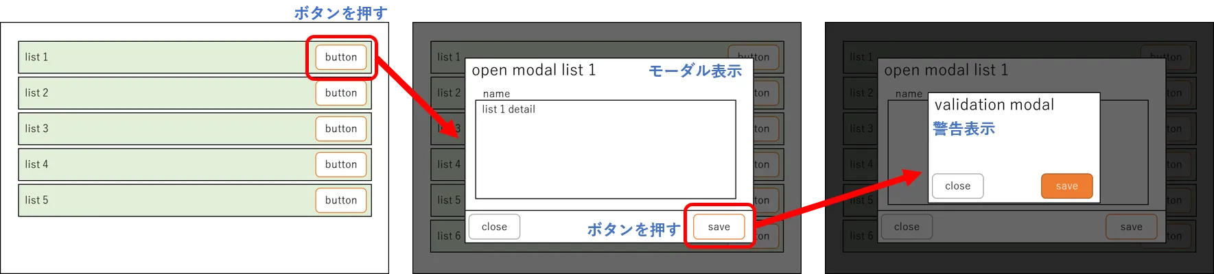
UXを高めるために、入力された情報が異常値である場合、保存ボタンを押せない、ボタンが押せない理由をメッセージを用いて表示する等ユーザの総操作数を減少させることはできます。しかし、「この情報に変更して本当にいいですか?」「本当に削除していいですか?」などモーダル上の操作に対する確認を別のモーダルを用いてユーザに注意喚起したいケースは多々あると思います。
この記事では、Angular11とBootstrap5を用いてモーダル呼び出し中に、別の確認モーダルを呼び出す多段モーダルの実装例について紹介します。
環境準備
Angularの環境構築 ⧉を行い、Bootstrapを利用できるようにします。 この記事の開発環境は以下の通りです。
| バージョン | |
|---|---|
| OS | Windows 10 Pro |
| Angular | Angular11 |
| Bootstrap | Bootstrap5 |
またAngularでは、以下のコンポーネントを追加しました。
| コンポーネント・サービス | 概要 |
|---|---|
| list.component | 一覧表示用のコンポーネント |
| modal.component | 一覧表示から呼び出されるモーダルコンポーネント |
| modal.service | 一覧情報からモーダルへ情報を渡すためのサービス |
| validation.component | モーダルコンポーネントから呼び出される確認用のモーダル |
├ app/│ ├ list/│ │ └ list.component│ ││ ├ modal/│ │ ├ modal.component│ │ └ modal.service│ ││ ├ shared/│ │ ├ interface/│ │ │ └ data.ts│ │ └ validation/│ │ └ validation.component│ ││ ├ app-routing.module.ts│ ├ app.component.html│ ├ app.component.scss│ ├ app.component.spec.ts│ ├ app.component.ts│ └ app.module.ts│├ assets/├ environments/...├ styles.scssAngularの実装例
Angular Cliを用いて、必要となるコンポーネント・サービスを追加しました。 実装上のポイントは2つあります。
- 2つ目の確認モーダルが閉じられた時にbodyのclassにmodal-openを追加する
- モーダルの背景となるBackdropのz-indexの並び順を注意する
list.componentの実装
ここでは、一覧表示用のテンプレートと、呼び出す2種類のモーダル、<app-modal>と<app-validation>を記述します。
list.component.ts
import { ModalService } from './../modal/modal.service';import { Component, OnInit } from '@angular/core';import { Data } from '../shared/interface/data';
@Component({ selector: 'app-list', templateUrl: './list.component.html', styleUrls: ['./list.component.scss']})export class ListComponent {
public list: Data[] = [ {listTitle: 'list01', about: '詳細情報'}, {listTitle: 'list02', about: ''}, {listTitle: 'list03', about: ''}, {listTitle: 'list04', about: ''}, {listTitle: 'list05', about: ''} ];
constructor( public service: ModalService, ) { }
/* 一覧の情報をモーダルサービスに渡す */ openModal(item: Data) { this.service.item = item; }}list.component.html
<ul class="list-group"> <li class="list-group-item d-flex justify-content-between align-items-center" *ngFor="let item of list"> <div class="listname">{{ item.listTitle }}</div> <div class="edit"> <!-- Button trigger modal --> <button type="button" class="btn btn-primary btn-sm" data-bs-toggle="modal" data-bs-target="#editModal" (click)="openModal(item)"> 編集 </button> </div> </li></ul>
<app-modal></app-modal><app-validation></app-validation>modal.componentの実装
list.componentから呼び出されるモーダルの実装です。
この実装では@Input()を利用せず、情報の受け渡しにはサービスを利用しています。
modal.component.ts
import { Component, OnInit } from '@angular/core';import { ModalService } from './modal.service';
@Component({ selector: 'app-modal', templateUrl: './modal.component.html', styleUrls: ['./modal.component.scss']})export class ModalComponent {
constructor( public service: ModalService ) { }}modal.component.html
<div class="modal fade" id="editModal" tabindex="-1" aria-labelledby="editModalLabel" aria-hidden="true"> <div class="modal-dialog modal-dialog-centered"> <div class="modal-content"> <div class="modal-header"> <h5 class="modal-title" id="editModalLabel">{{ service.item.listTitle }} </h5> <button type="button" class="btn-close" data-bs-dismiss="modal" aria-label="Close"></button> </div> <div class="modal-body"> <div class="form-group"> <textarea class="form-control" rows="5" [value]="service.item.about"></textarea> </div> </div> <div class="modal-footer d-flex justify-content-between align-items-center"> <button type="button" class="btn btn-secondary" data-bs-dismiss="modal">閉じる</button> <button type="button" class="btn btn-warning" data-bs-toggle="modal" data-bs-target="#validationModal">保存</button> </div> </div> </div></div>modal.serviceの実装
一覧からモーダルに情報を渡すためのサービスです。
modal.service.ts
import { Injectable } from '@angular/core';import { Data } from '../shared/interface/data';
@Injectable({ providedIn: 'root'})export class ModalService {
public item: Data = { listTitle: '', about: ''}
}validation.componentの実装
モーダルから呼び出される、確認モーダルです。 この実装では、モーダルの保存ボタンをクリックすると呼び出されるようにしています。
<button type="button" class="btn btn-warning" data-bs-toggle="modal" data-bs-target="#validationModal">保存</button>validation.component.ts
bootstrapのモーダルはbodyタグにmodal-openのclassを追加し、モーダルが閉じられたタイミングで、classのmodal-openが削除します。
モーダルが表示されている状態では、背景画面の操作は無効となりスクロール等も制御されます。
2枚目の確認モーダルが閉じられたタイミングでは1枚目のモーダルが開かれた状態のため、イベントリスナーを使ってmodal-openを再付与する必要があります。
closeModal() { var validModal = document.getElementById('validationModal') validModal?.addEventListener('hidden.bs.modal', function (event) { document.getElementsByTagName('body')[0].setAttribute('class','modal-open'); }); }import { Component, OnInit } from '@angular/core';
@Component({ selector: 'app-validation', templateUrl: './validation.component.html', styleUrls: ['./validation.component.scss']})export class ValidationComponent implements OnInit {
constructor() { }
ngOnInit(): void { this.closeModal(); }
/* 2段目の確認モーダルが閉じられるときにbodyのclassにmodal-openを追加して 1段目のモーダルが開かれた状態に戻る */ closeModal() { var validModal = document.getElementById('validationModal') validModal?.addEventListener('hidden.bs.modal', function (event) { document.getElementsByTagName('body')[0].setAttribute('class','modal-open'); }); }}validation.component.html
<div class="modal fade" id="validationModal" tabindex="-1" aria-labelledby="validationModalLabel" aria-hidden="true"> <div class="modal-dialog modal-sm modal-dialog-centered"> <div class="modal-content"> <div class="modal-header"> <h5 class="modal-title" id="validationModalLabel">変更前確認</h5> <button type="button" class="btn-close" data-bs-dismiss="modal" aria-label="Close"></button> </div> <div class="modal-body"> 本当に保存しますか? </div> <div class="modal-footer d-flex justify-content-between align-items-center"> <button type="button" class="btn btn-danger" data-bs-dismiss="modal">戻る</button> <button type="button" class="btn btn-warning">保存する</button> </div> </div> </div></div>実装画面の確認
ここまでの実装で多段モーダルのコンポーネントおよびサービス側の大まかな実装は完成します。
| 表示画面とレイヤー構造 |
|---|
リスト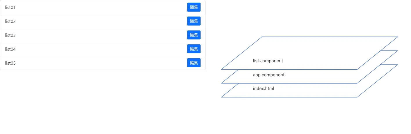 |
モーダル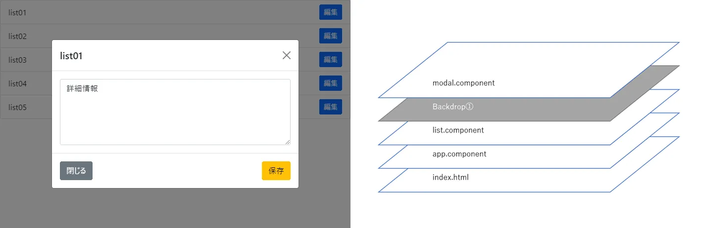 |
確認モーダル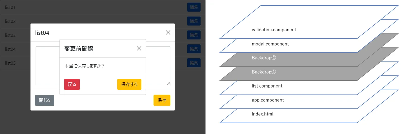 |
確認モーダルは、レイヤー的に下から一覧、灰色背景①(backDrop)、灰色背景②(backDrop)、モーダル、確認モーダルの順に表示され、確認モーダルと灰色背景の順番で表示されません。
期待した順番は一覧、灰色背景①、モーダル、灰色背景②、確認モーダルの順番です。
この状態では、確認モーダルのボタンは操作できますが、通常のモーダルの閉じると保存をクリックすることもできなくなります。これはBootstrapのCSSでは多段モーダルに対する設計がされておらず、z-indexの値が1050で固定されていることに起因する問題です。
デベロッパーツールを用いて構成を確認
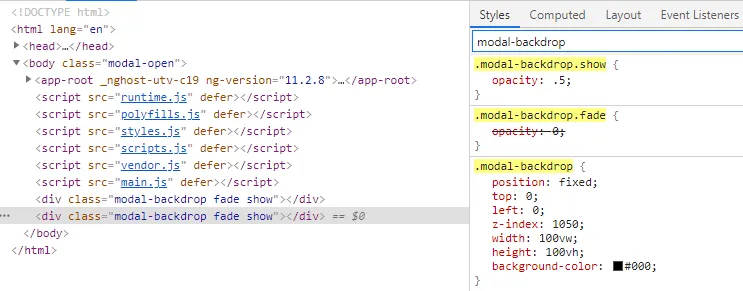
.modal-backdrop.show { opacity: .5;}.modal-backdrop { position: fixed; top: 0; left: 0; z-index: 1050; width: 100vw; height: 100vh; background-color: #000;}多段モーダルに対応させるために、root直下のstyles.scssに追記を行います。
.modal-backdrop.show { z-index: 1050;}
// 2つめの灰色背景.modal-backdrop.show + .modal-backdrop.show { z-index: 1060;}
// 2枚目確認モーダルのz-index#validationModal.modal { z-index: 1070;}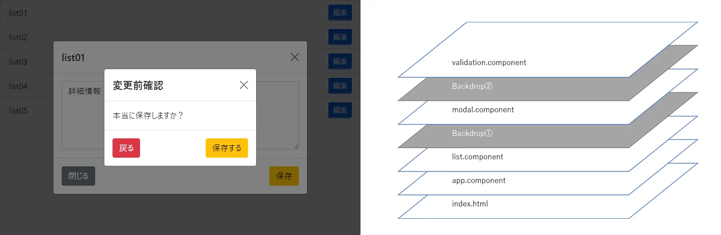
これで多段モーダルの実装は完成します。3枚以上のモーダルを組み込む場合、scssに.modal-backdrop.show + .modal-backdrop.show + .modal-backdrop.show...と追加し、z-indexを変更していくことで対応できます。
所感
モーダルを利用したダイアログの表示は、ユーザの注意を引くための強い効果があります。1画面内での多段モーダルの表示は、背景側に回ったコンテンツをユーザからブロックしてしまうという弊害はありますが、即時対応を必要とされる処理の中では有効という考え方もあります。
多段モーダルを用いる場合、ダイアログの利用ガイドラインを定め、本当に画面をロックしてモーダルを使ったユーザと対話が必要なのか、確認の1工程のコストに見合う内容が、そのダイアログなのかをを考えると、本当の意味でUXの向上が望めるのではないでしょうか。
記事の執筆にあたっては情報の正確性に努めておりますが、掲載されている文章やソースコード、設定ファイル等の内容について、完全な正確性や安全性を保証するものではありません。活用される際は、必ず公式ドキュメント等をご自身で確認のうえご判断ください。